

We struck a deal with MGI Software to license and customize their PhotoSuite III photo editing product to be part of our The Print Shop product line.

The Print Shop is a popular layout application targeted to the home user. It’s well-regarded as an intuitive a tool for home do-it-yourself designers who love to create their own greeting cards and other communication documents.

I collaborated with the project marketing manager to create test plan outlines for Print Shop user in-home testing, 1-1 testing, and focus groups (outside firm did the testing).
We learned the following:
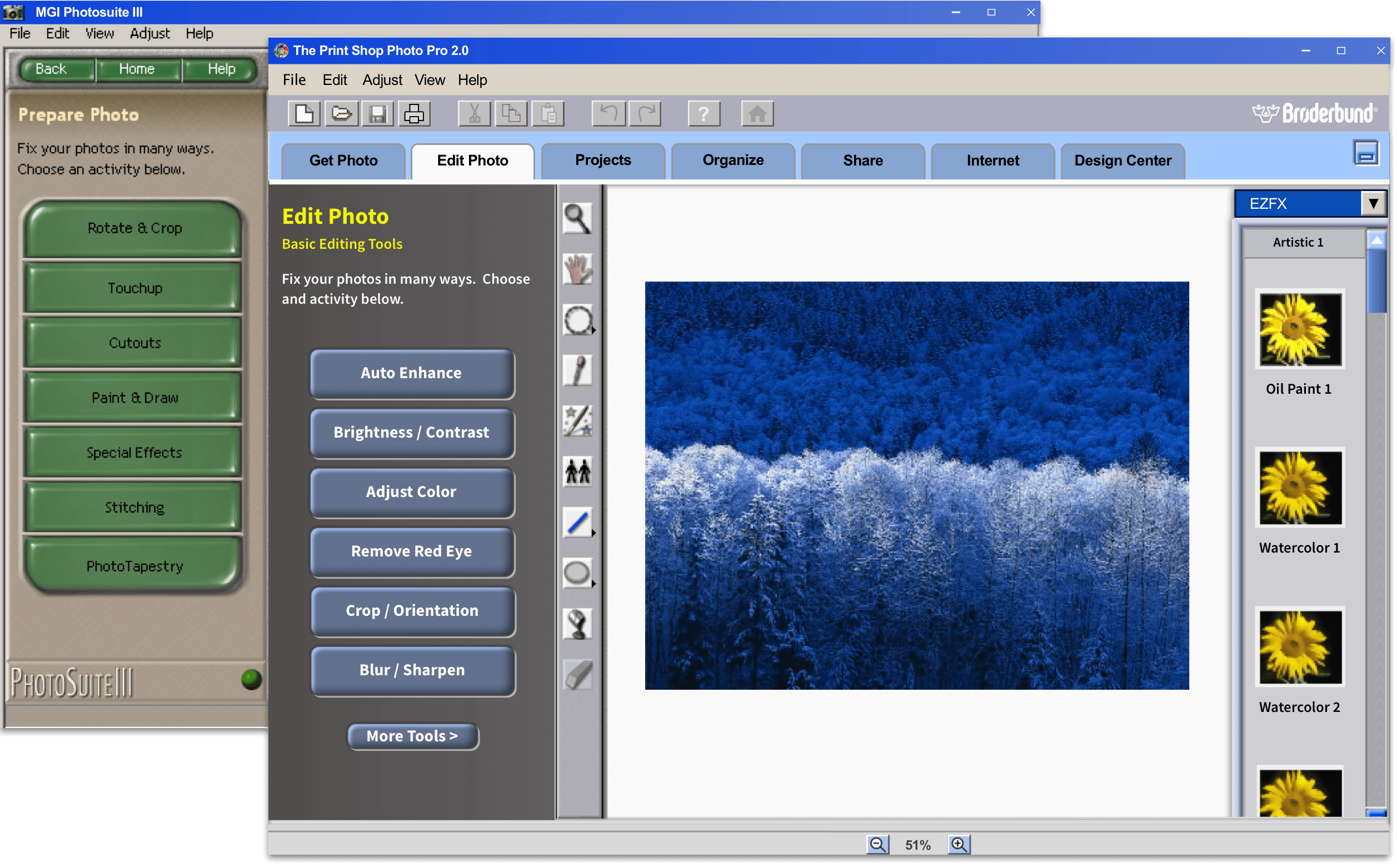
Upon entering the photo editing part of the program, MGI PhotoSuite provided many different editing choices in the Activity Panel. However, the most popular tools were buried a level or two down. Our test respondents said that these were the tools they would most likely use frequently:
The team redesigned the Edit Photo mode IA to show the most popular tools at the top level with the choice to go deeper by clicking the “More Tools” button.

Upon clicking a mode button in PhotoSuite (in this case Compose), the mode changed but the button didn’t show that it was selected.
We changed the buttons to tabs to give a better indication of the currently selected mode.

Consistency with The Print Shop and Windows UI was key in helping users to learn Photo Pro.
We made sure that Photo Pro had a UI that users were familiar with:

Photo Pro provided lots of effects users could apply to their photos, such as blur, color treatments, and warping. All of the effects had adjustment controls.
To speed the application of effects for novice users and those not wanting to remember settings, we provided one-click easy effects, aka“EZFX”, a new feature.
I created a clickable prototype, for stakeholder evaluation, to validate adding EZFX to the library strip on the right side of the UI.

We understood that a photo editing application could be daunting for our users. We wanted to make sure they understood how to achieve their goals by providing:

The Print Shop Photo Pro was well received and went on to generate $1Million+ in gross sales.
The usability redesign project was challenging and fun and inspired me to pursue UX design as a profession. :)