Here’s how I used the UX design process to create a cooking app prototype for the iPhone platform. The work was performed for the UX Design Professional Certificate at UC Berkeley.
My goals were to:

I was starting from a "blank slate", so I researched popular cooking apps to learn about how cooking app companies try to meet user needs.

After getting a big-picture perspective by doing competitive research, I wanted to get first-hand opinions about features and app usage.
I conducted a 10-question survey of 20 people on Survey Monkey to find out about what features they liked in a mobile cooking and app, as well as their pain points.

Survey results:
Based on user need to start recipe search by ingredient:
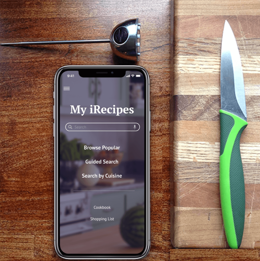
Based on user need to view recipe on phone:

Based on my research, I now had an idea of a user flow that I wanted to mockup and prototype. Here I created a customer journey - a visualization of a process that a user may go through to accomplish a goal and pain points experienced along the way.

A storyboard was created to depict Mary successfully using the Guided Search feature to meet her recipe search goal.

I created a persona to really understand who I was designing for. It was important to understand their goals and frustrations so that my app design would provide solutions for them.

User stories were written for the UX team to articulate how a piece of work will deliver a particular value back to the customer.

A navigation map was created to outline and organize how the user would go from screen to screen in a full app design.

The Guided Search feature lets the user pick from a series of choices - protein, cooking method, cut, and flavor profile in a wizard format to better narrow their search results.
In-person tester feedback:
I created a wireframe with a different layout and flow based on feedback from lo-fi paper prototyping.

I conducted a remote, unmoderated test using Sketch/Invision on Usertesting.com. There were eight testers.
Feedback for guided search:
Feedback for improved readability of recipe while preparing a meal:

I added a visual design treatment to the wireframes.

Click here to see the Figma prototype in a new browser tab.

Initial tester feedback about the proposed features was generally positive. However, more metrics are needed to measure the success of these ideas.
Task Success Rate: do quantitative research to measure the percentage of participants that successfully complete the Guided Search steps to view a recipe and save it to the cookbook. Also, measure task success of feature vs. other search methods, such as browsing, key word search, and search by cuisine.
Customer Satisfaction (CSAT): do more qualitative research to find out how well features aid completion of planning and preparation goals.