
The IA website makeover was a project I completed for the Information Architecture (IA) and Content Strategy course at UC Berkeley Extension. We were asked to pick a website, user test this site to find out where users had difficulty achieving their goals, propose solutions, and then retest to see if there was improvement. I chose Lenovo.com.
My IA improvement goals were twofold:

Lenovo.com is a large and complex site, catering to both consumers and businesses.
With the limited amount of class time for the analysis, I chose to focus on the effectiveness of the global navigation when used on a desktop computer.
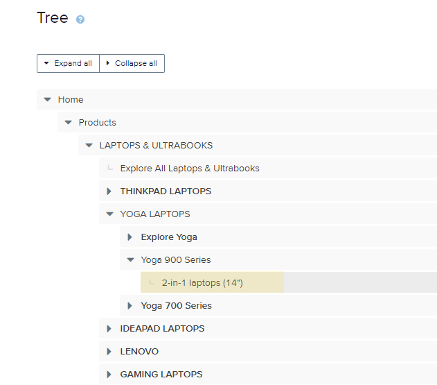
A navigation map for the global nav is pictured here.

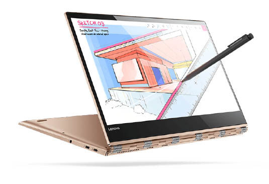
I looked at some competitive to see where in the information architecture they place 2-in-1 laptops. Unlike Lenovo.com, the choices were at an easy-to-find top level.
In addition to looking at the site from the viewpoint of a perspective 2-in-1 owner, I polled some classmates to find out some of the their top reasons for using Lenovo.com.
Here is the task list:
We used OptimalWorkshop.com to conduct a Tree Test.
I created a menu structure for the Lenovo.com global navigation and asked testers to find the menu choices described in the task list above.

Optimal Workshop rated users success in completing a particular task using a minimal number of clicks.
The higher the score, the easier it was for the user to find what they were looking for.
Conversely, the low scores (highlighted in yellow) show that the respondent needed many clicks to achieve their goal. These extra clicks are considered “pain points” in UX terminology.
I needed to find out where users would expect to find these options.
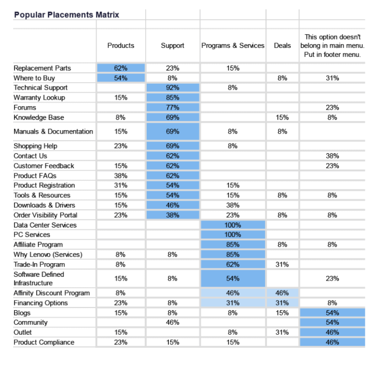
I asked testers to do an online version of a card sort by categorizing menu choices into global navigation buckets. In some cases, testers thought that a choice belonged in the footer rather than the site header.
The Popular Placement Matrix helps to pull the data together by showing where the menu choices were categorized.
The blue highlighting indicates, on average, where the tester expected to see the menu choice.

Based on the card sort data, I created two new menus for the global nav to make it easier for testers to complete the tasks.

A second tree test shows that the respondents more quickly found the menu choices they were looking for.

Here I created some wireframes for a revised menu better highlighting a 2-in-1 laptop choice.

At the end of this project, I checked the Lenovo.com website and found that they added a 2-in-1 laptop to the Product menu. (!)